Building a Design System for Engineering Apps
Parsons
Establishing a new design system for modeling and simulation engineering applications at Parsons.
Role: UX, UI, Branding
Product: Desktop Applications

Adobe XD

Confluence

GitLab

Designer
Developer
Establish a new design system that considers existing technical project constraints.
Standardized design components, improving product consistency and code efficiency for 50+ developers.
Upon joining the Tools Team in August 2023, I learned that the number of products and staff was going to rapidly grow. Yet, there was no existing design system for the project. To help the team scale design and development, this was the perfect opportunity to introduce and establish a new design system for the team.
As the sole Product Designer, creating the design system from scratch would be too costly. My approach therefore was to adopt and adapt existing design systems to:
Lower costs
Implement quickly
Provide some customization
I decided to reference Material Design, Carbon Design System, and Atlassian Design System for these main reasons:
Consistency
Scalability
Documentation

Design System ReferencesMaterial (Google), Carbon (IBM), and Atlassian were the main design system references.
I first focused on core elements such as color, typography, and icons. After the foundations, I created style guidelines for common UI components and patterns. New design tokens also helped streamline building, maintaining, and scaling UI components.

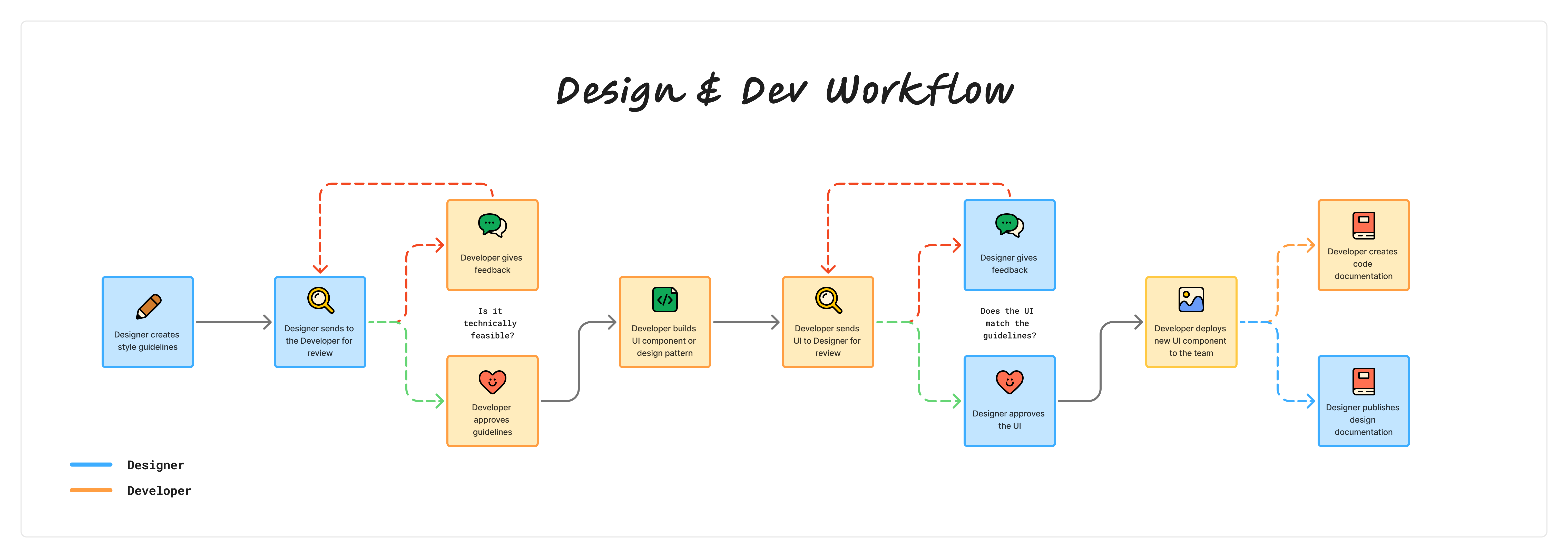
RoadmapThis roadmap illustrates the overall design strategy for creating the new design system, split into 4 main stages: Foundations, Design Tokens, Components, and Design Patterns.
I collaborated with a Senior Developer to help address any technical constraints. We both ensured the designs were compatible with the UI library our team used. We also drafted documentation, providing both design and code guidelines to reference.
In a span of 3-4 months, we were able to publish and deploy core design system tokens, components, and patterns.


The design system has improved product consistency across various internal tools. Although still a work in progress, these efforts mark a huge step forward in the project's design maturity.
90+ colors, 14 text styles, & 1,390 icons
100+ design tokens established
15+ design components and patterns
"Now that things have been setup, it's helpful to have a standard to fall back on and to help with keeping the product consistent." "The current design system is really intuitive which I enjoy. I can look at the style guidelines and then go straight to the code guidelines to find which component I need to implement...in general, the design system has made my coding time for UI elements a lot shorter!""The style guidelines have been helpful for having a resource I can pull from to refer to and speed up the process of work...The coding guidelines are helpful and keep everything standardized and easy to refer to across projects."What I learned:
Creating a design system doesn’t have to start from scratch. It’s okay to adopt and/or adapt existing systems to provide what’s best for the project based on time, budget, and needs.
Collaborating with developers early on is crucial to a smoother design-to-development process.
What's next?
As the number of tools grows, continuing to maintain and contribute to the design system are ongoing efforts as well as improving documentation.


